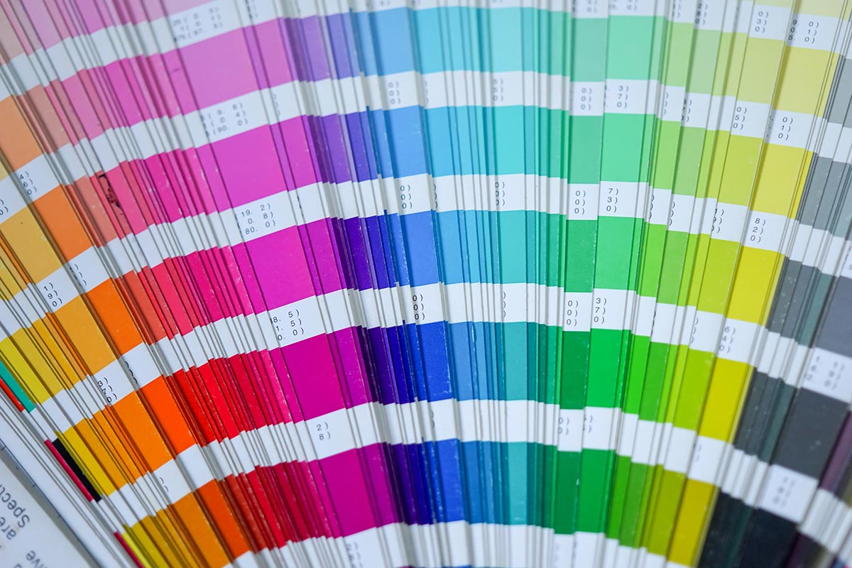
Many people think there’s more to choosing colors for branding and advertising than what first meets the eye. Color psychology is the study of color and how it impacts our behaviour and how we perceive a brand in the context of marketing. For instance, corporations may purposefully pick various hues based on their perceived capacity to provoke a particular emotional reaction.
Studies have shown that people’s interactions with things and other people are influenced by color. People make decisions based on their first interactions with people or items within 90 seconds. Additionally, color accounts for between 62 and 90 percent of that perception. Even if the subject of color’s involvement in marketing is controversial, it’s nevertheless critical to comprehend the psychology and cognitive process involved.
Effects of Color on Brand Recognition
Consumers should understand the worth of a brand from its colors. Designers spend a lot of time considering it as a result. Because color has such a big influence on how people perceive a brand, it’s crucial to make sure you’re projecting the proper one. According to color psychology, various emotional associations are fostered by certain hues. Here are some emotional reactions connected to various hues, per Forbes.
Red
A power color is red. It stands for fervor, love, desire, tenacity, and bravery. You can certainly think of a few companies right away that use red as their major brand color. Consider Tesla, 3M, Netflix, Chick-fil-A, Time, CNN, CNN, Target, and Coca-Cola.
Orange
Orange is a vibrant hue that stands for competitiveness, energy, and production. Some well-known companies with orange in their logos include Dunkin’ Donuts, Nickelodeon, The Home Depot, Etsy, Hermès, Reese’s, and Amazon.
Yellow
Yellow is a color that draws attention. It stands for joy, elation, and positivism. Yellow is comparable to orange in that it likewise exudes energy. National Geographic, Snapchat, Best Buy, Ferrari, McDonald’s, Nikon, IKEA, and Sprint are a few well-known companies using yellow logos.
Green
Green is an earthy color that represents nature, luck, harmony, relaxation, and freshness. Sprite, Spotify, Starbucks, Whole Foods, Android, Hess, Xbox, and Hulu are a few examples of businesses that incorporate green into all aspects of their branding.
Blue
Blue has a relaxing effect and stands for reliability, tranquillity, intellect, and honesty. Blue is a common hue used by several well-known companies, including Ford, Walmart, IBM, AT&T, Facebook, Pepsi, PayPal, American Express, and Intel.
Purple
Purple is often associated with royalty. It stands for luxury and richness as well as honor, courage, spirituality, and magic. Purple may infuse your branding with a feeling of fun and creativity, while being a more daring option. Crown Royal, Twitch, Roku, Yahoo!, FedEx, Taco Bell, and the Premier League are well-known companies with purple logos.
How to Choose the Right Color for Your Brand
The most effective hue for your brand should be determined by what your audience responds to, despite the fact that color psychology is supported by science. At Wild Window Graphics, we can assist you in developing unique graphics, films, and designs for your building that will enhance the perception of your brand. Therefore, get in touch with one of our professional team to begin developing the ideal branding for your company right now!


 2,956 customer reviews